Stationery Etiquette: How to Choose Stationery
 “A WOMAN is known by the stationery she uses. Paper talks. We read between the lines, along the margin, and across the envelope, the story of good or bad taste which speaks in tone, texture and design.” So opens A Desk Book on the Etiquette of Social Stationery published in 1910 and written by Jean Wilde Clark. What was true then, with a slight tweak, is still true today. Our stationery can speak worlds about us. What’s changed? “The Rules,” or stationery etiquette, are more relaxed: we no longer must use black-bordered mourning stationery after a loved one’s death, for example. In addition, we can all agree that men have just as much of a need for stationery, and that their stationery choices speak for them too.
What’s more, in this age of fast fashion, speed-of-light communication across the globe, what’s “In Style” changes on a dime. And that makes us lucky: there’s no need to cram our taste into rigid expectations of what’s proper or even what’s in style. Sure, white or ivory paper will always be correct. But if you want to use red pepper, who will care? Citrus paper? Be my guest. The fabulous Jackie O used robin’s egg blue paper. If she could do that in the 1960s, the sky is the limit for us in the late 2010s.
On the one hand, the lack of stylistic expectations is liberating, because it means we have the freedom to choose whatever stationery suits us. On the other hand, it can be slightly intimidating, because we’ve got almost unlimited choices.
 Let it be your style.
There’s one rule to follow in 2017/2018: You be you. Don’t worry about what a friend is doing, or what you saw in a magazine.
Not sure what you like? Look at the furnishings in your home and the clothes you wear.
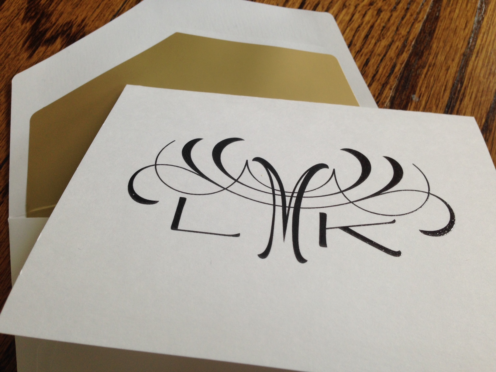
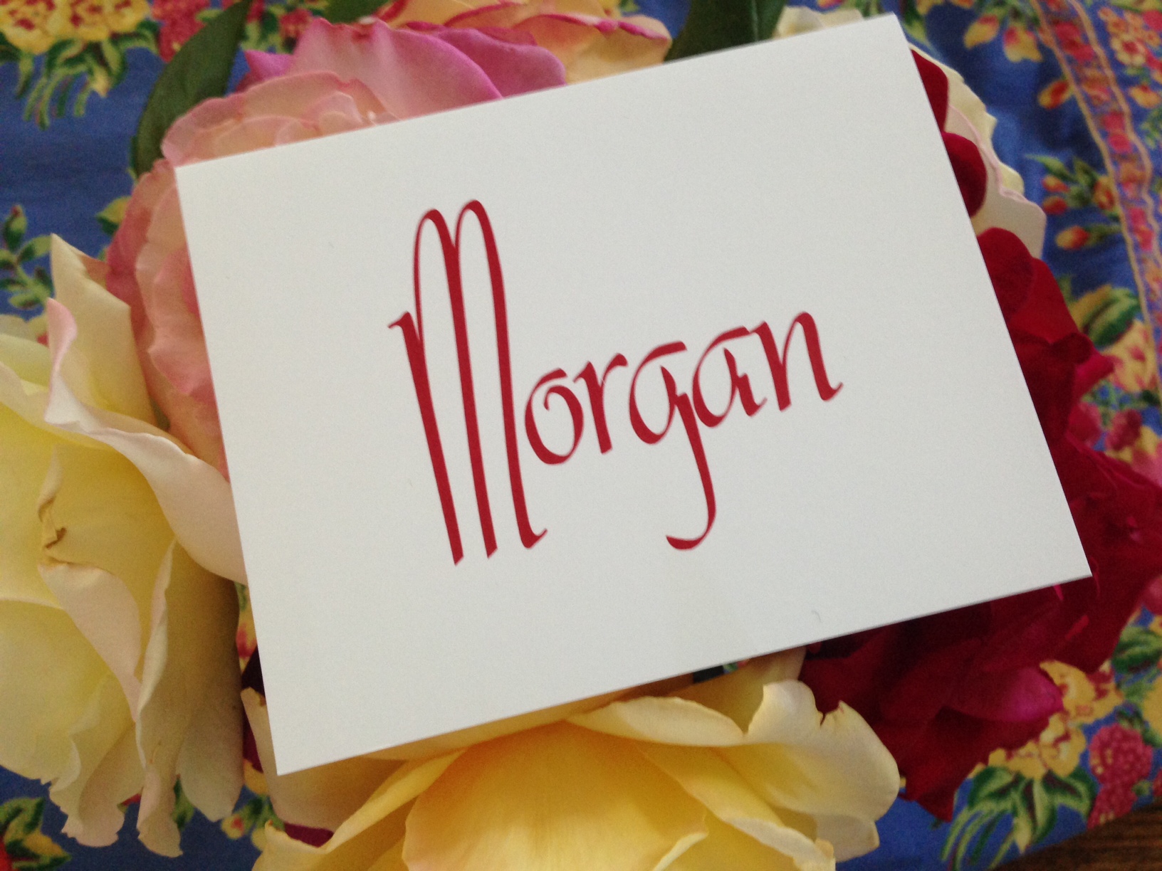
Do you tend toward traditional (try a 3-letter monogram), primitive country (try a quirky or hand-lettered font), or contemporary (try your name in block letters)?
Like neat, clean surfaces (look for simple lettering) or do you like to cram every nook and cranny with beloved objects (look for curvy, embellished designs)?
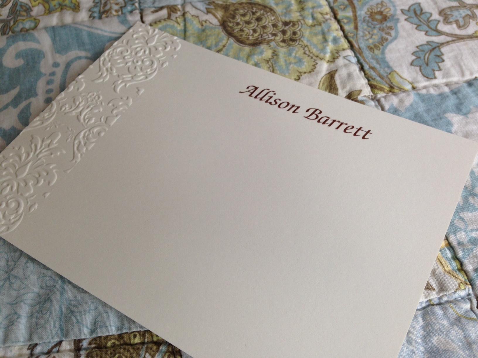
Do you like to follow the rules (center the personalization at the top) or do you like to push them (personalization goes in a corner or at the bottom)?
What colors do you like to surround yourself with? Pastels? Metallics? Jewel Tones? Neutrals?
Take advantage of the preview function when considering lettering styles for your name. Scrutinize the way your initials look – perhaps you like one font’s S better than another?
These are great clues to help you pull together your stationery style. In the end, whatever you choose will be perfect, because you chose it.
 Business or personal?
When you’re writing a note to your pastor, the school principal, or your favorite author, you might want to consider a more formal letter sheet or correspondence card that tends toward business-like. Perhaps it’s embossed. Perhaps it’s on white paper with gray ink. Or ivory paper with coffee ink. This stationery might include your middle initial and the formal version of your first name.
It will work equally well for when you’re sending a gift to your best friend, writing to your brother, or thanking your neighbor for her homemade scones. Or, for those more personal uses, you could purchase a second set that reveals your more relaxed side. Any form — letter sheet, flat card or folded note — will do. Perhaps there is a small illustration, or your nickname, rather than your given name. You might use colored paper with black or metallic ink or a more brightly colored ink on ivory paper.
Raised ink vs. embossing?
It’s really a matter of choice. Raised-ink printing, or thermography, is a more affordable version of engraving. Engraving, a centuries-old printing method, requires the creation of dies, which are expensive to produce and reside at the stationery company until you require more stationery. Raised-ink printing conveys a pleasing texture and a shimmery quality to the ink.
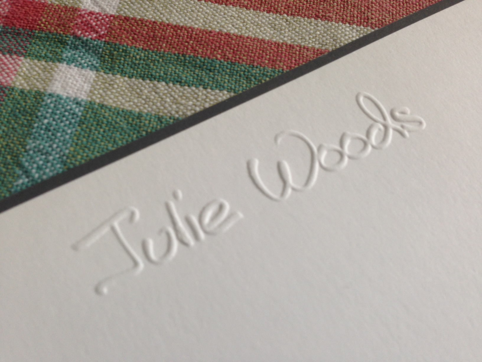
Embossing lends an even more delicious texture because the paper is pressed from below. In that sense embossing resembles traditional engraving, as well. Especially on white or ivory paper, embossing tends to be more formal. It also tends to be more earth-friendly, because the paper recycles easily.
So to recap, choosing stationery can be an enjoyable and fulfilling exercise. Taking time to think about your style and consider your options will reward you each time you sit down to write. See all of our personalized correspondence cards and folded notes. Happy choosing!


Leave a comment