Typesetting Terms You Should Know
What is good typography? We can all spot good design in a telephone, car or clothing: You know quality when you see it. It’s the same for personalized stationery. It’s easy to see, but hard to pull off. Modern typography follows a long heritage — back to typesetters who used to place small blocks with letters on them into a printing press. They used rules that are still alive today. So it’s good to know your typesetting terms, so you can know good personalized stationery when you see it.
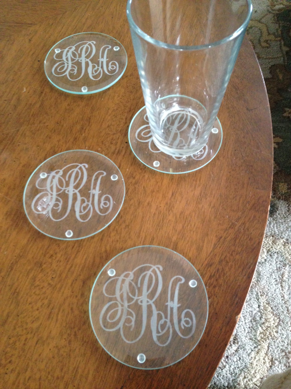
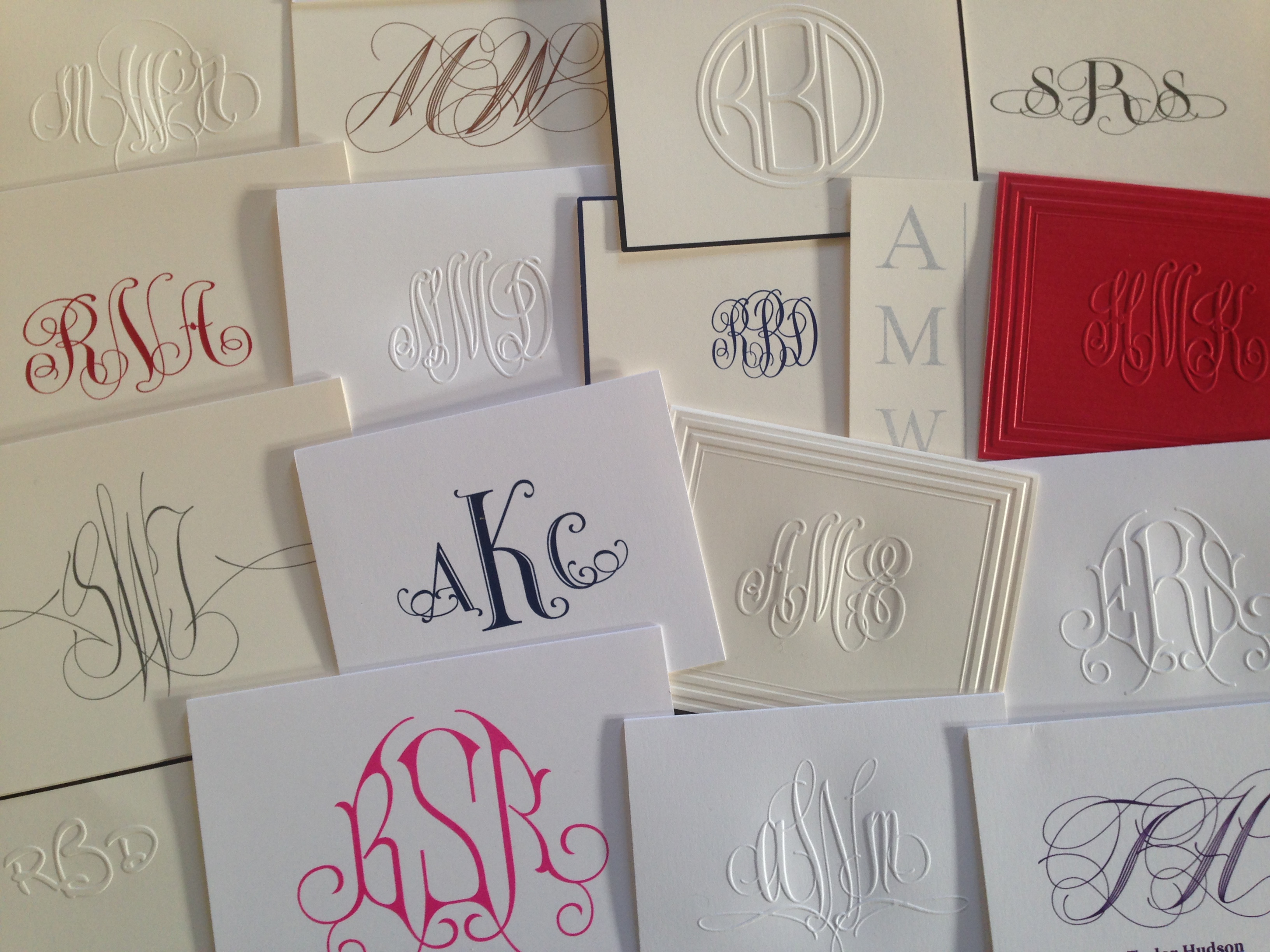
Our professional designers spend a lot of time getting the look and spacing perfect for each and every letter in all of our exclusive fonts. A name or monogram should have good spacing between the letters, and the style of individual letters should relate to one another. Shop with care: other companies don’t always pay attention to these important rules.
Here is a glossary of typesetting terms to help you understand the ins and outs of good design on personalized stationery.
Vocabulary about Letters
Here are some typesetting terms that related to the shapes of the letters.
Upper Case – A letter that we learned in school as a “capital letter.” Fun fact: Employees in old printshops kept these letters in the upper drawers of their cabinets…hence the name “upper.” We use upper case letters for proper names and the beginnings of sentences.
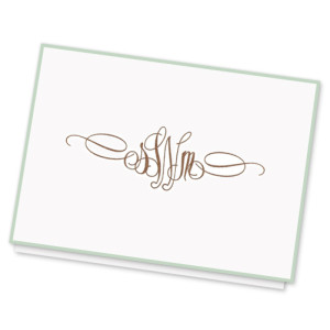
Lower Case — The small letters we use for most words in a sentence and for names. Often, we use upper case letters in monograms, but not always. Our Elise monogram uses lower case letters. Sometimes it’s fun to break the rules, as in this fun new font on our Luna Card, which features all lower case letters and no upper case ones.
Serif – A tiny embellished notch that appears at the tip of the stroke of a letter. Many serif fonts have a traditional or classic feel. They can also, but not always, feel more formal. Fonts with a serif tend to be easier to read. It’s thought that the little hooks on the ends of the letters help your eye track more quickly from one letter to the next. The font used in this blog is a serif font.
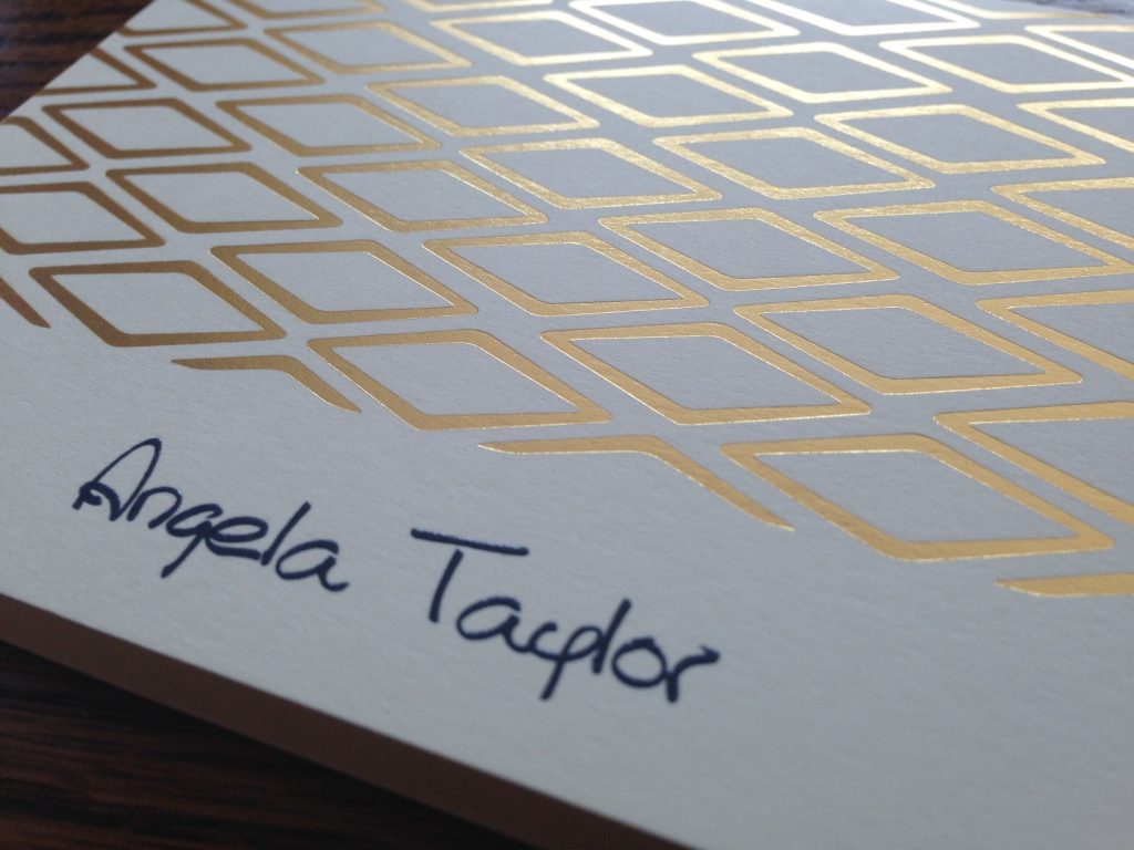
Sans Serif Lettering – A more modern-looking style of lettering that tends to be more plain, clean or simple. One of our most popular sans serif lettering styles is here on our One-Line Note. It has a “Mad Men” feel to it, doesn’t it?
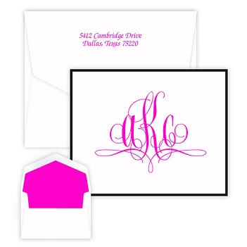
Roman Lettering – A kind of alphabet that features small, decorative serifs at the tips of each letter. The Magnolia Note has a roman lettering style.
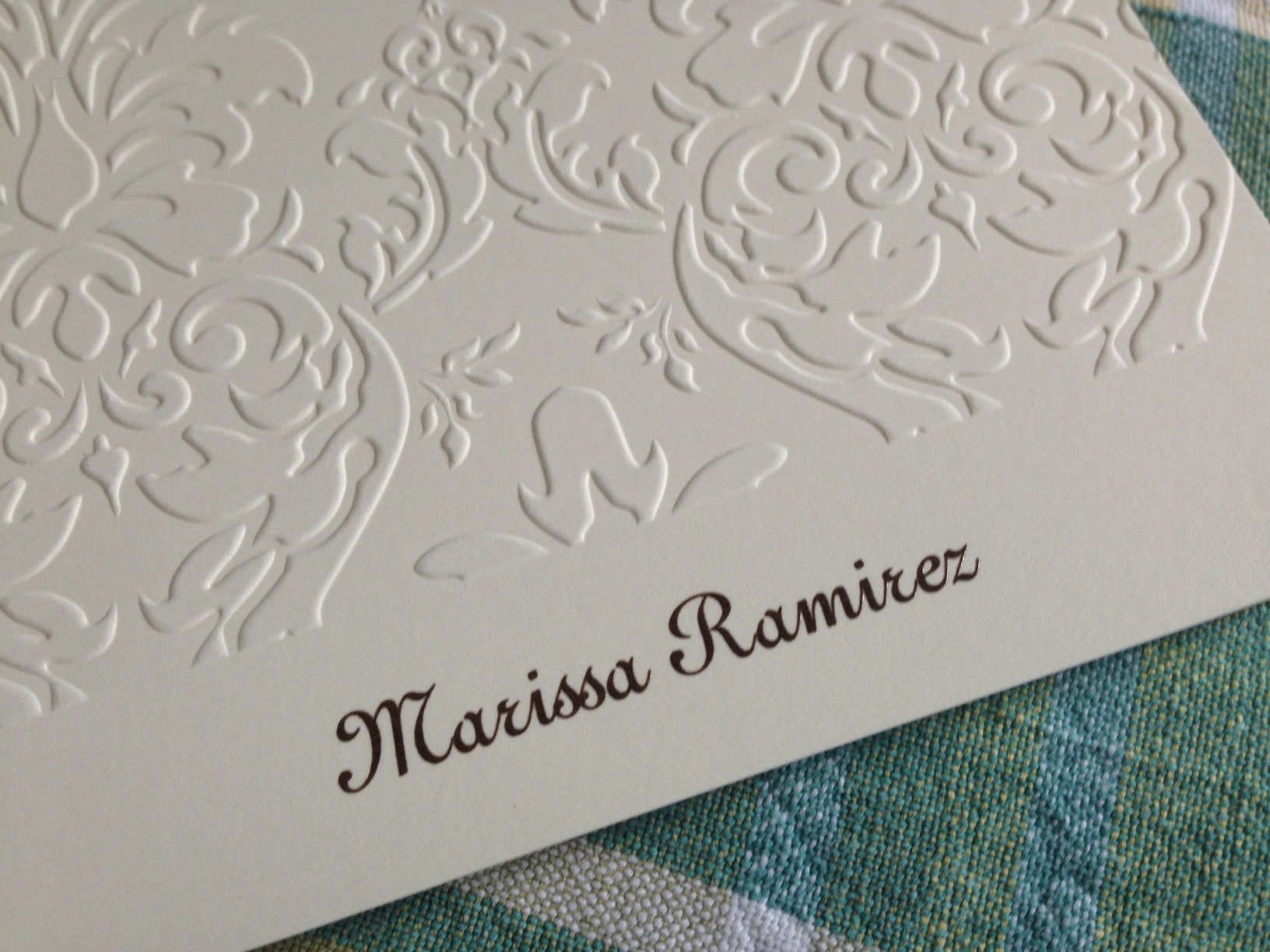
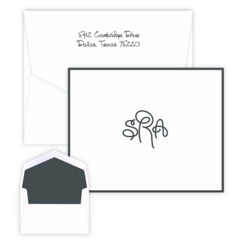
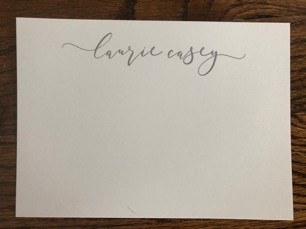
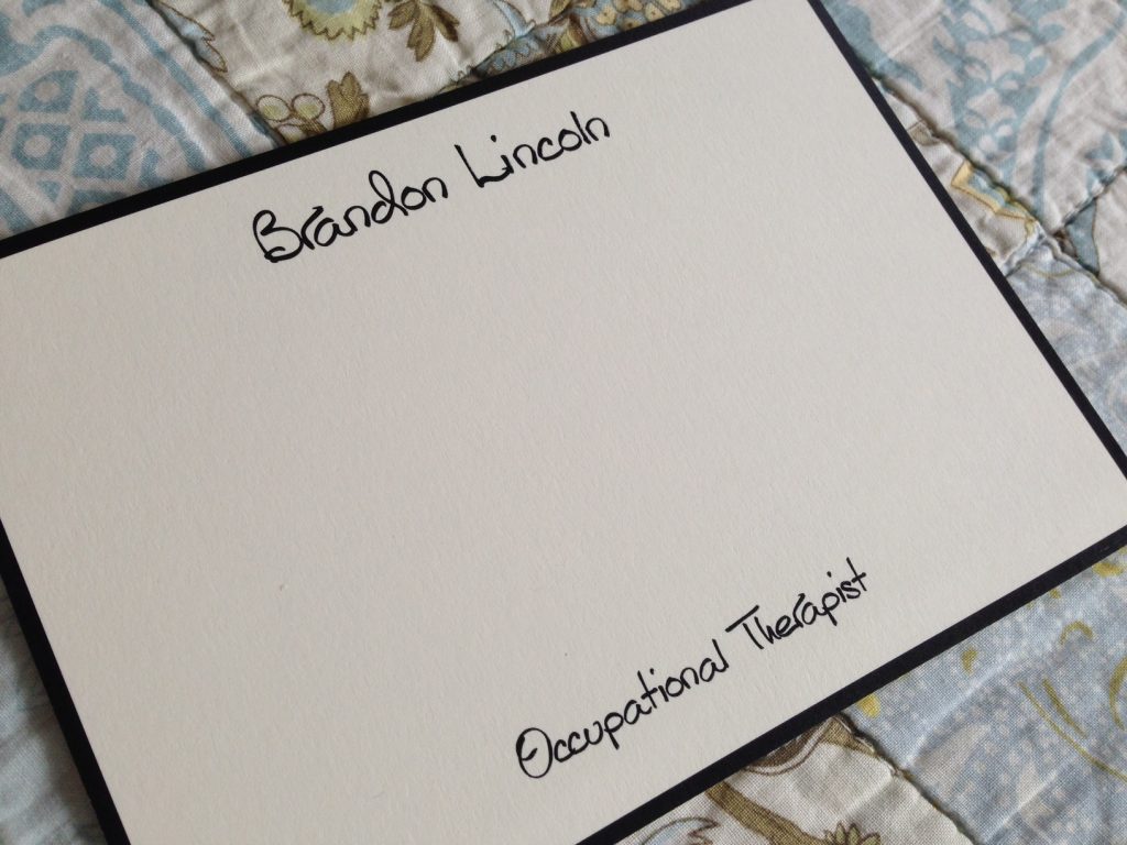
Handdrawn Lettering — Some lettering styles mimic handwriting or printing. Our Anthony lettering style is one of these, which is shown below on our Anthony Studio Card. We often have developed lettering styles from real people’s handwriting that we admire. Read this blog about the development of our Sally Script font.

Vocabulary about Spacing
Here are some typesetting terms that related to the spaces between and around letters, words and lines of texts.
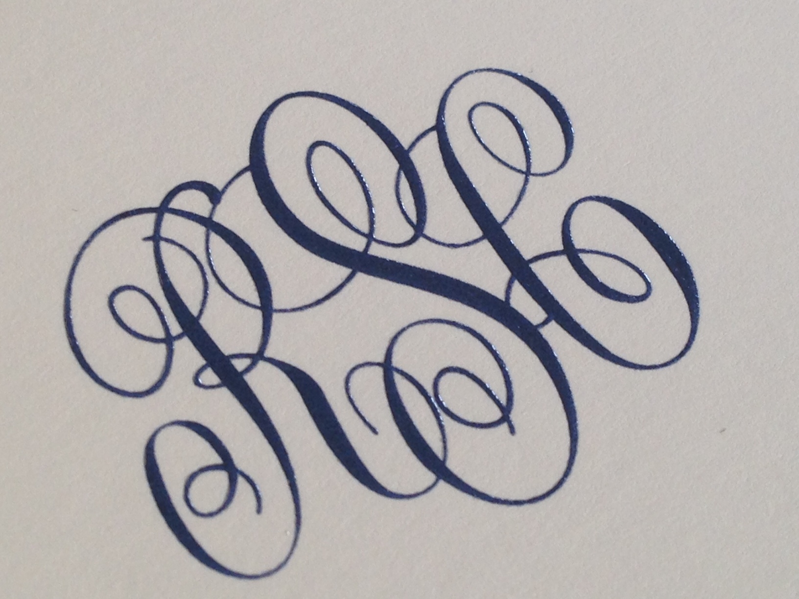
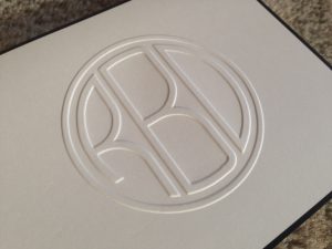
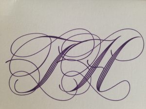
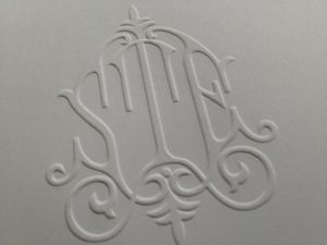
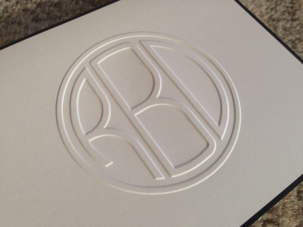
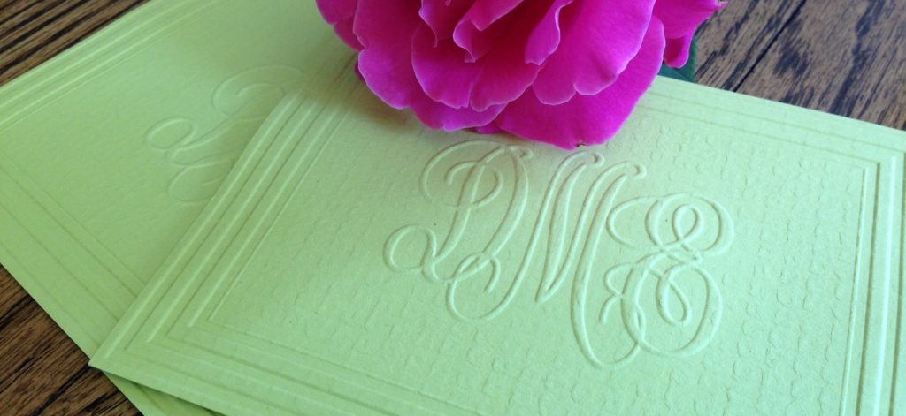
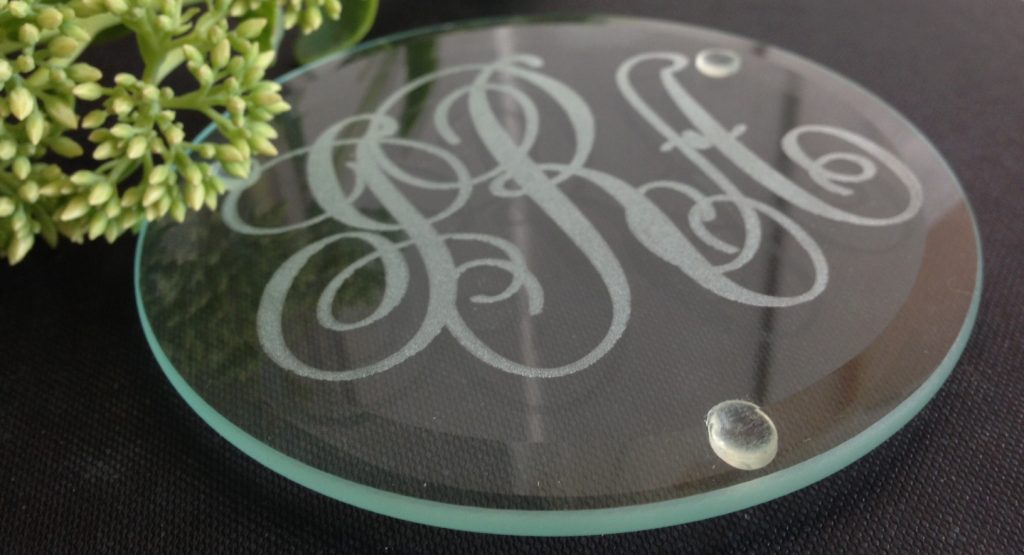
Kerning – The distance between letters inside of a word. When letters inside a word touch each other, we describe the kerning as “too tight.” When there is so much space between letters that the words are difficult to distinguish from one another, we say the kerning is “too loose.” We pay enormous attention to the kerning when letters are combined in a name or monogram, as you can see in the photo below. It’s our Circle Monogram on our Henley Grand Monogram Note.
Leading — Pronounced “ledding,” this is the blank space between lines of type. Wedding invitations usually have “open” or “expanded” leading, while the text in books usually has a “tight” (compressed) leading.
Flush Left – The alignment of the left side of all paragraphs is a straight line as you look down the page, such as this one. This is typical for many publications.
Flush Right – The alignment of the text down the right side is a straight line. This paragraph is flush right. It’s a little unusual, and so it catches your eye. Some of our products that use flush right are X and X.
Ragged Left and Ragged Right — “Ragged” means that the beginning or ending of a line-of-type does not line up vertically with the other lines of type. When you format text to be flush left or flush right, the opposite side of the paragraph will be ragged. Most paragraphs on this page flush left and ragged right. But oftentimes, wedding and other formal invitations feature text that is ragged left and right, like this paragraph is. We also call this type of text “centered.” You can see this on our Yorkshire Invitation Card.
Of course, you can depend on all products by Gifts In 24 to feature excellent typographical design. Check out our monogrammed products. Or look at our best-selling folded notes.


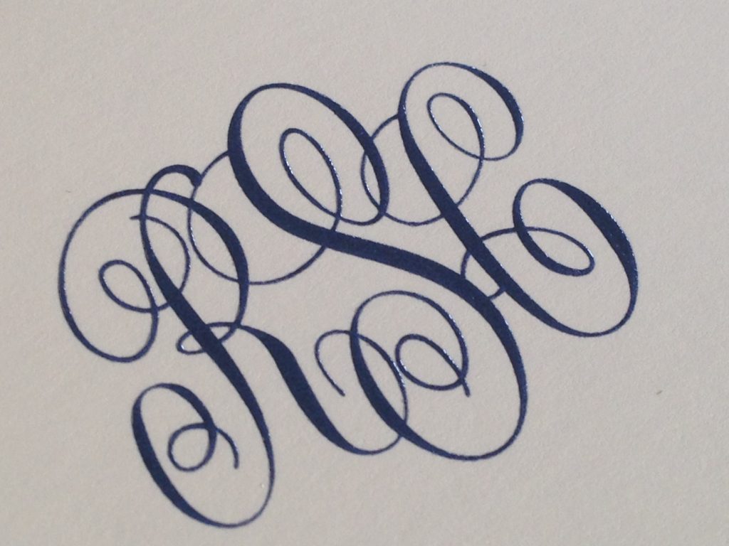
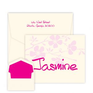
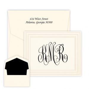
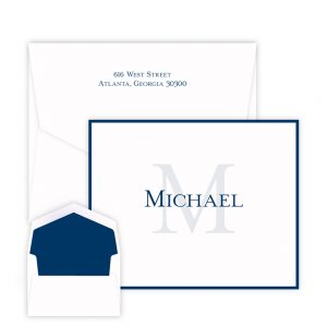
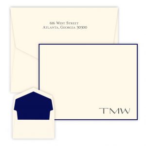
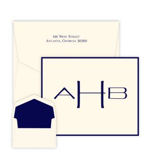
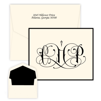
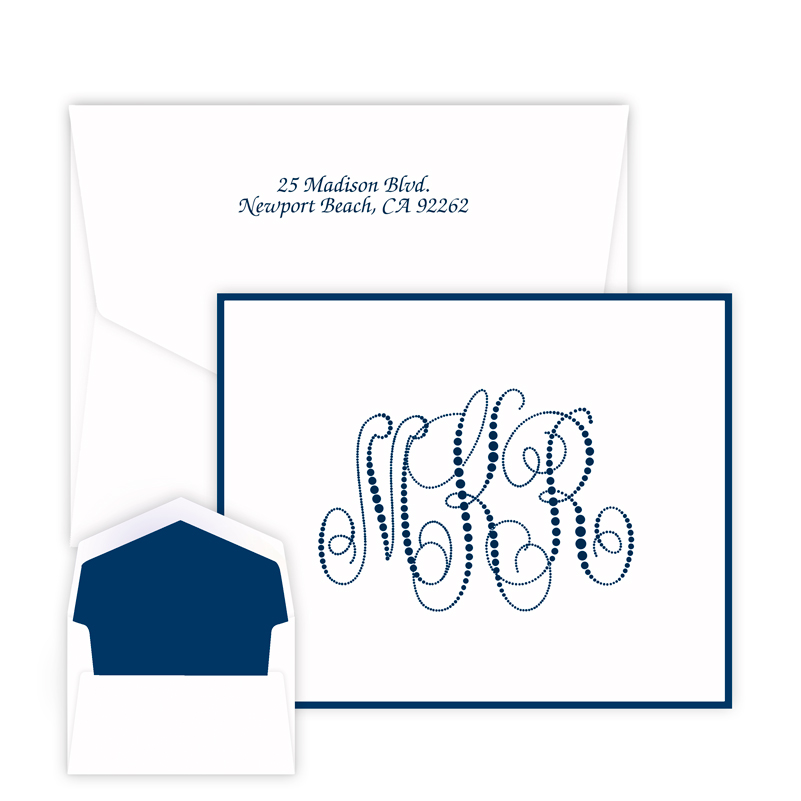
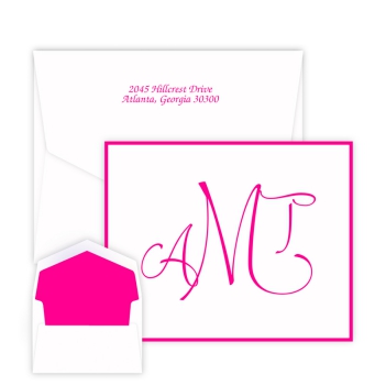
 Giftsin24.com offers dozens of lettering styles and monograms. We pride ourselves on offering you lots of choices to find that perfect typeface that matches your personality. We offer different lettering style choices on different products. When you’ve found a favorite lettering style, you can now more easily and quickly find products that offer it with our new Personal Style Tool.
