Logo Logistics: What Goes into Redesigning a Logo
You know how you feel when you get a new haircut or a new suit, or even when you paint your bedroom a new color? You have that exciting sense of feeling refreshed and pulled-together and that, finally, everyone is able to see the real you. That’s how we feel about our new logo for Giftsin24. Have you noticed it?
Ryan Monahan, Giftsin24 designer, and Richard Pauling, Giftsin24 president and owner, worked together to design the new logo. We talked to Ryan to get the inside scoop on what went into designing the new logo, its typography and what’s next.
G24: What was your main goal with the new design?
Ryan: We wanted to update our logo without straying too far from the original design. We knew we wanted to use a serif typeface (the kind with “hooks” at the ends of the letters) and we wanted it to reflect an older, Roman typeface. To me, this logo looks literary and traditional. It implies learning and education. You might see this kind of lettering on a bookstore window.
G24: Tell us about how you designed the new logo?
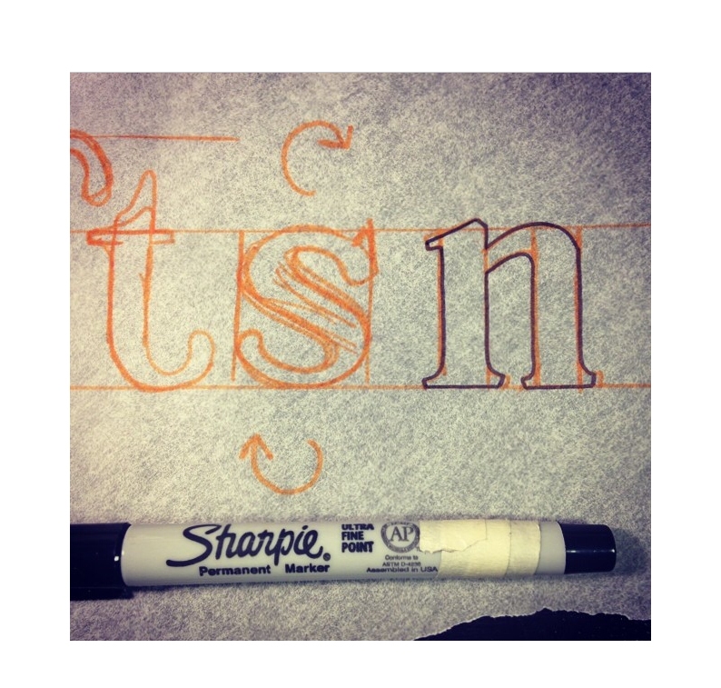
Ryan: We made the lettering here in-house. We established the main concept relatively quickly. Then it took a little longer to decide on the silhouette and polish it. In total, I hand drew about 20 different concepts and variations on paper. Next, we converted it to vector art, so we could use it on the website. A vector image is made up of tiny points. Most logos are vector art, so that you can blow it up as large as a billboard or shrink it to the size of a business card, but it won’t lose quality. On the other hand, pixels make up a raster image (like a cell phone photograph), and that image loses quality quickly if you try to make it larger.
We G24: Anything special about its characteristics?
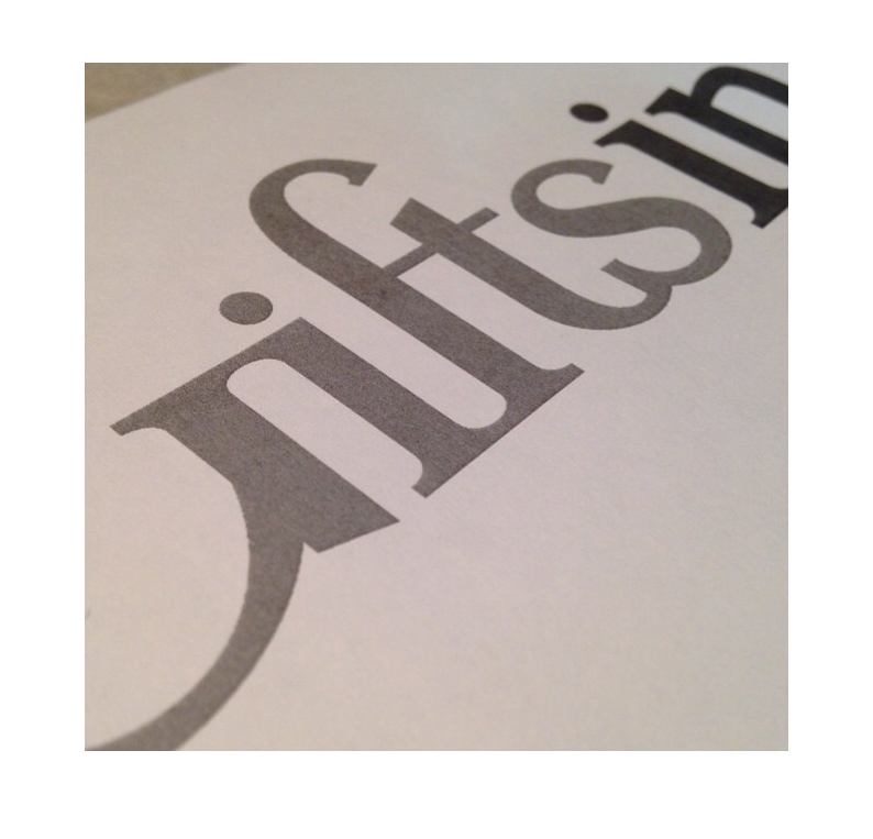
Ryan: I made it a point to include ligatures: those are typically two adjacent characters that are joined together. When you write the word little, you might use a ligature to connect the two t’s. Here, three letters join, the F, T and S, which is a bit unusual and unique. Another thing you might notice is that the lettering is fairly vertical. You can see this especially in the G. The letter G can be very round and bulbous. We made ours more condensed, more vertical. We also condensed the numerals 2 and 4 in this way. Finally, a dot above the letter i is called a tittle. We put it uncharacteristically low, very close to the top of the i. We like that style.
G24: What’s next?
Ryan: This new iteration retained the same brown and navy colors of our old logo, but we have been discussing changing the logo colors at some point, but I’ll let that be a surprise.


Leave a comment